
As in nearly all aspects of the company, the art department at id Software runs on pure synergy. That is, no real distinct lines of responsibility exist among us three artists (other than the fact that fellow artists Kevin Cloud and Adrian Carmack — along with programmer John Carmack – also happen to own the company) because we work together so well as a team. Sure, we each have our particular strengths and weaknesses, but in the end, any of us can do any aspect of the art needed for the game. The strength of the three-man art department at id comes from experience, hard work, and talent. Adrian Carmack, Kevin Cloud, and I created the art for QUAKE 2 (and the upcoming mission pack), and this article reveals how it all came together.
Production Design
Our team begins the art process with a solid production design and tons of sketches. This is the basis upon which we build models, create map textures, or skin characters. We contracted a very good production design artist to help with the environment concepts for QUAKE 2, but for the most part, conceptual art and production design comes from one of the three artists here at id. Although we had to design the art based on our game design ideas, our main goal was simple: “Make it cool.” That pretty much summed up our design philosophy.

Our team went for a grungy, sci-fi look for QUAKE 2, so the enemies are barbaric races of miscreants sporting an array of cybernetic prostheses. The rationale behind this design was that the inhabitants of Stroggos (the planet where the game takes place) aren’t much into aesthetics and are purely a warlike, spartan race. The good guys were designed with a futuristic military look. Weapons, armor, and other aspects of the Terran Coalition of Man are easily recognizable and not too far removed from contemporary military and weapon design. Our intention was to spare the player the effort of stretching his or her imagination too far in pondering the purpose of an object. Is this a weapon in my hand, or is it a bread-maker?
Noticeably missing from QUAKE 2’s production design was any form of demonic symbolism. This wasn’t due to any political or publisher-induced corporate pressure; it was because it didn’t fit the theme of the game. If the Strogg had developed into a magical/netherworld-dependent race of conquerors, we would have had plenty of demons running around doing demon-type activities. QUAKE 2 is about kicking some alien butt on their turf and ensuring mankind’s future survival.
Level Texture Maps
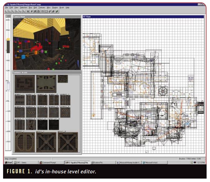
Although technically there are only three artists at id, an argument can be made for including the level designers in the pool of pixel and vertex pushers. The designers make maps, and in order for them to build the world, they need plenty of building material. We used an in-house editor (designed by John Carmack), which allowed level designers to take our textures and turn them into geometric shapes. The level designers then used these shapes to fill in the architecture (Figure 1). We call these shapes “brushes.”
Typically, the process of handing the level designers the textures that they needed for a map went like this. First, we artists created a series of “base” textures — generic textures with a certain look that could be reused throughout different areas of the game. We also created textures specific to certain areas as dictated by the design document, such as the “mines” texture set or the “factory” texture set. All textures were required to be sized in a power-of-two (for example, 8 pixels × 8 pixels, 16×16, 32×32, 32×64, 128×128, 128×64, and so on) (Figure 2).
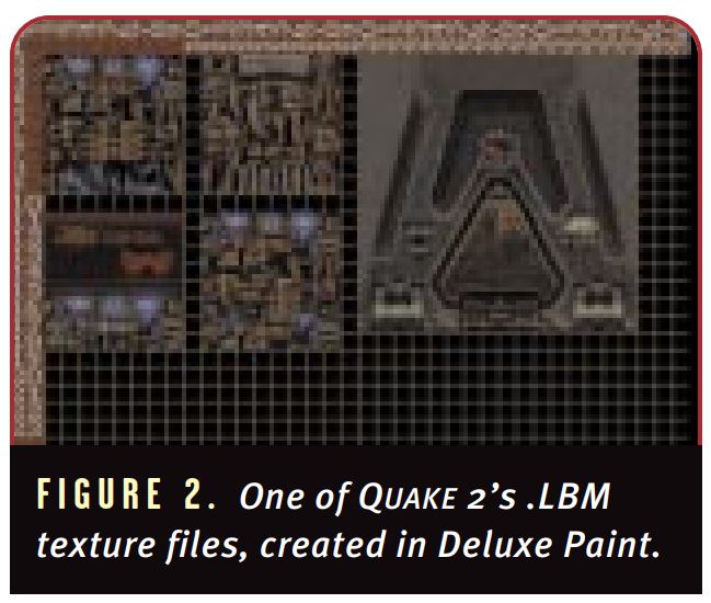
All of the in-game textures in QUAKE 2 were created using Electronic Arts’ venerable Deluxe Paint, and for some animations we also used Kinetix’s Animator Pro. You may chuckle at our choice of Deluxe Paint, as the program has been around for ages. But for static manipulation of pixels using a 256-color palette, there really is no substitute. Sure, Photoshop and other programs designed to work in true color can be used to do 256-color tweaks, but Deluxe Paint is a worthy tool.
The reason QUAKE 2’s textures turned out so well is due to our hand-drawn approach to creating them. Using what’s called “nearest pixel” methodology, we ensured the integrity of each texture by paying special attention to the proper amount of anti-aliasing. Sometimes, a stippled or dithered effect is appropriate, but simply rendering a scene in a 3D package and slapping it into a game without modifying the image will often result in “pixel swim.” While massaging an image pixel by pixel is painful and time-consuming, it’s a necessary process. However, as 3D accelerator cards become more popular (and in some cases, mandatory), bitmap interpolation will address the problems associated with pixel swim.
Skinning Characters
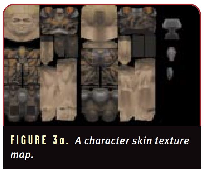
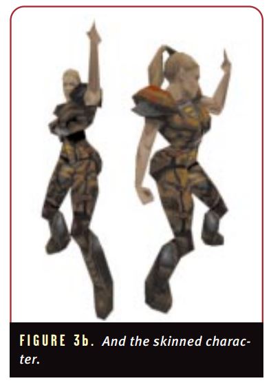
To skin our characters (skins are textures that are projected linearly onto a character’s model), we had to warp the models’ base frames in order to get the maximum amount of coverage (a base frame being a reference-only state of deformation for the generation of the texture map) (Figures 3a and 3b).
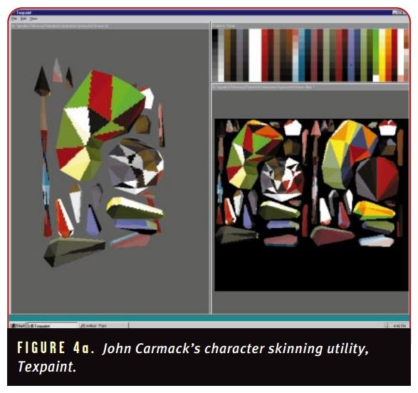
To help us artists skin characters, John Carmack wrote a tool (in a weekend, no less) called Texpaint, which allowed us to paint directly onto a mesh, much like the commercially available tool Positron’s MeshPaint. Texpaint proved to be invaluable. Though fairly simple, the tool nevertheless featured unlimited undo capability, showed model and texture lines, and let us select any pixel resolution for the texture sheet. It also gave us the ability to generate a triangle-unique multicolored “start” skin for clarity and identification of possible problem areas (Figure 4a).
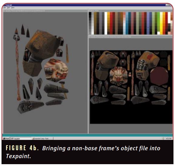
Using Texpaint to create a skin was a simple affair. First, we’d load up the base frame and click the New Skin menu item, which generated an .LBM (Deluxe Paint’s native file format) for the character on which we wanted to paint — the .LBM’s resolution was based on the mapping coordinates of the loaded object. Then, we’d bring in any other non-base frame’s object file from the object’s directory, retaining the previously generated base texture (Figure 4b).
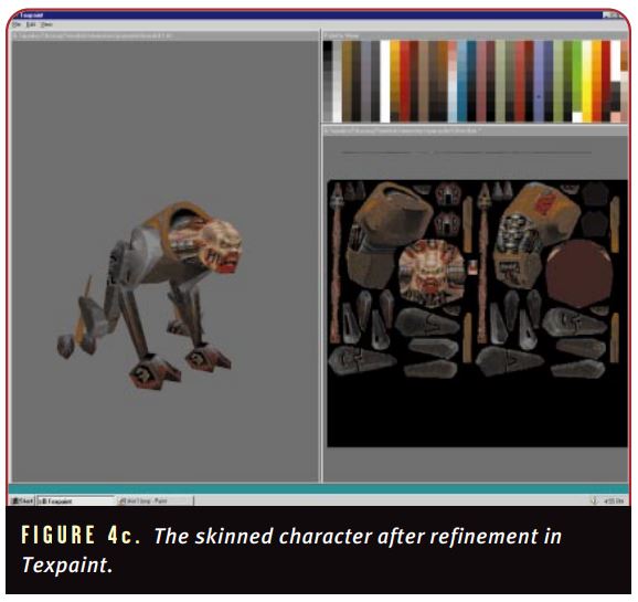
Texpaint would then help us take the model from its deformed base frame state to a polished, finished object (Figure 4c).
As we’d draw on the .LBM object, the changes to the skin appeared simultaneously on both the texture page and the skinned object itself. This method worked especially well when we used Texpaint and Deluxe Paint in conjunction with Animator Pro. Our process consisted of marking out certain areas on the skin, using either Deluxe Paint or Animator Pro to refine these areas, and then reloading the skin into Texpaint for further refinement. All of the artists on our team had at least two computers (a Windows NT system and a Windows 95 system), so using the Windows NT-based Texpaint and the DOS-based Deluxe Paint in tandem wasn’t really a problem because we could rely on our network to transfer the files and our twin 21-inch monitors for instant feedback. Once textures were completed, they were handed off to the programmers, who converted them from .LBM to .PCX format for better consumption by the game engine.
Inanimate game objects, including the view-model weapon that characters used, required only one skin since these objects didn’t change states during the game. (Viewmodel weapons are those that you see in your hands while playing the game, and worldmodel weapons are those that you run over to add to your inventory.) The monsters and player characters, however, required an additional “pain” skin to convey that the creature or player was hurt. This different texture wasn’t sector-based in any way. We merely switched out entire skins when a character’s hit points reached a critical level.
View Screens, Option Screens
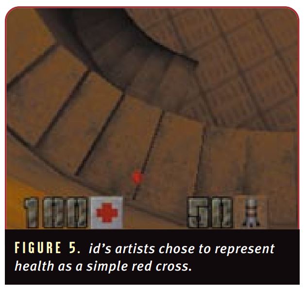
The look for the main-view and option screens in QUAKE 2 were designed to fit the basic militaristic theme of the game. We chose a clean and uncluttered look for the status bar for simplicity’s sake. When we released Q2test (the public beta version of QUAKE 2) on the Internet, we featured a face at the bottom left of the screen (likely familiar to QUAKE and DOOM players) that reflected the damage state of the character and even indicated from which direction the player was being hit. Unfortunately, since players can choose from about 30 different deathmatch characters, we decided that implementing an animated face for each deathmatch character would be too time-consuming — we decided to use the universal red cross on a white background instead (Figure 5).
Although no faces are displayed on the status bar during game play, the player does get a snapshot of the chosen character in the multiplayer setup menu (Figure 6).
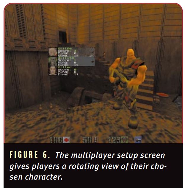
A rotating model of the chosen character also allows casual perusal of the model and skin. While we would have liked to use these same snapshots in the status bar during game play, it wasn’t possible due to their resolution. The portraits of the characters in the multiplayer setup menu are 32×32 pixels; the highest possible resolution for any graphic in the status bar was 24×24. It all came down to the fact that the 32×32 versions were done first, we didn’t have time to do secondary versions of them, and we didn’t feel that 24×24 was enough pixels to do justice to the different faces. So we opted for the red cross.
QUAKE 2’S view and option screens were created last and constructed with functionality and practicality in mind. We were constrained to these screens by code that was already in place from the previous game. In addition, while we would have loved to have had all kinds of tricky animated buttons in the front-end menus, why make the player run through a maze of information just to change an option? Time and functionality concerns dictated QUAKE 2’s spartan interface.
Modeling
Basically, two types of models exist in QUAKE 2: Alias models and B-models. Alias models were created using Alias|Wavefront’s PowerAnimator on an SGI (an Indigo 2 Extreme with 256MB RAM). B-models are “brush models” created by level designers from the previously mentioned textures. Another way that we gave the designers working material for their level creation was in the form of an internally-developed tool called 3DS2MAP. This little utility took nonconvex shapes built in Kinetix’s 3D Studio R4 and converted them into brush models that could be used in either QUAKE or QUAKE 2 levels. 3DS2MAP helped overcome some of the deficiencies of the designers’ inhouse development tool (the QUAKE Editor), such as its inability to create perfect spheres, domes, or weird geomorphic shapes such as boulders or rocks. Tim Willits, the lead designer on QUAKE 2, gave me the strangest look when I made him a half-dozen rocks one time in about five minutes; he said it would have taken him days to do that in their editor.
Alias models were used for characters and objects in the game as well as the view model and world-model weapons. We also used Alias models for miscellaneous map-specific objects, such as radar dishes and the ships that fly by occasionally. We used 3D Studio R4 for the bulk of the character modeling because once the normals are reversed, 3D Studio files can be exported as .DXF files (the AutoCAD file format) and easily imported into PowerAnimator.
If you’re wondering why we didn’t just use PowerAnimator’s modeling capabilities for every object, the answer is me. Kevin Cloud actually did use PowerAnimator exclusively. However, I was responsible for most of the models and I used the product that I know best: 3D Studio R4. Simply put, I don’t care for PowerAnimator’s modeler. I know 3DS4 like the back of my hand and treat it as my 3D sketchbook. I can complete a model in about the same time that it takes to work up the same design on paper.
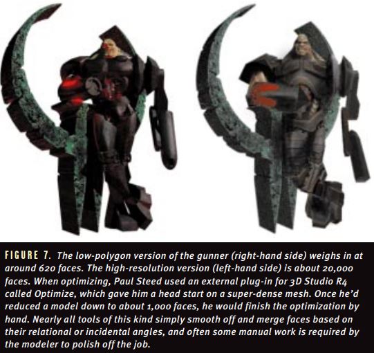
Objects’ face counts were dictated by the “less is best” doctrine (that is, be as economical as possible with model polygon counts). The creation of all the models was, however, an iterative process, and optimizing them was an art form unto itself. For example, Figure 7 shows a high-resolution version of the gunner that I created for an Australian magazine cover, along with the version of the same character as it appeared in the game.
CHARACTERS. Our goal was to keep basic enemy characters to 600 faces or less, although some reached as many as 700. Most were in the 400 to 500 range. Boss characters, due to their uniqueness and the fact that they were often alone on their level, ranged from a hefty 1,500 faces to a whopping 2,500 faces for the final boss Makron (astride his mount, Jorg). The player character was exactly 600 faces, but because we did the weapon as an overlay, you could actually say the male and female player characters were around 750 faces each.
VIEW-MODEL WEAPONS. When you play QUAKE 2, the weapon model that you see in your hands is slightly to the right or left. This is because of the way that we optimized the viewmodel weapons (Figures 8A and 8B).
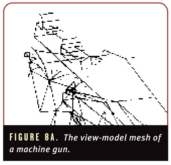
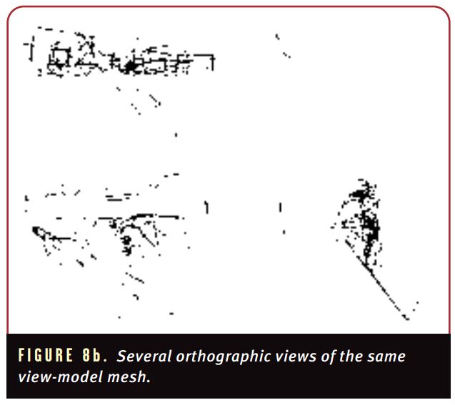
The view-model weapons are the most optimized models in the game due to their visually restricted and visually predictable nature. What you’d see if the weapons were slid over to the middle would be hardly recognizable as a weapon, because the side view shows more of the texture mapping details. Keeping the weapons (and the hands holding them) under 400 faces was no easy task. Not only did the weapon and hands have to look realistic, but in most cases, had to animate as well.
Creating the view model so that it appeared correctly in the world was sort of tricky. Because the game engine gives you a ninety-degree field of view (FOV), objects that are close up are severely skewed and seem stretched out. To adapt to this FOV limitation, we created the weapon models and then viewed them in a camera window approximating the same view of the game. The models also had to be squashed somewhat to compensate for the stretching effects on nearby objects in the FOV. Only after quite a bit of tweaking did we achieve the correct results. Once we were satisfied that the weapon looked good from the proper angle, that version was saved and the arduous task of optimizing it down to more digestible measurements began. In my opinion, the weapon view models were probably the most challenging and most satisfying of the models done for QUAKE 2.
GENERAL OBJECTS. General objects such as ammo boxes, armor, weapons, or anything that you can you pick up were also created with the “less is best” philosophy (Figure 9).
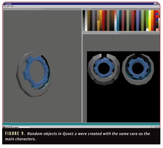
These objects rarely surpassed 200 faces. The subtle pulsing glow around the objects is for the gaming aspect of the artifact and is understandably necessary to ensure its visibility.
The modeling in QUAKE 2 was done with the same attention to detail as all other parts of the game. We wanted to make visually interesting characters and objects that fit within the plot and design of the game. We put as many characters and objects into the game as the single CD and time would permit. The characters and objects that didn’t make it into QUAKE 2 will most likely rear their low-polygon, ugly heads in the upcoming mission pack that we’re working on.
Animation
All of the in-game, non-rendered animations in QUAKE 2 were done in PowerAnimator. We feel PowerAnimator is simply the best program for character animation available. The strength of PowerAnimator for doing character animation lies in the amount of control you have over each vertex. A tool that provides subtle degrees of influence over individual vertices makes a big difference in the realism of a bicep or elbow joint that maintains its integrity as it flexes. If your program doesn’t allow you to control elements at the vertex level (as opposed to a tool that merely assigns influence to an area of vertices), you’ll run into problems sooner or later.
CHARACTERS. The following is QUAKE 2’s general character animation process:
• Create the character or import it from 3DS4 into PowerAnimator.
• Build a skeleton inside the mesh to support its animation.
• Attach the mesh to the skeleton and name the clusters accordingly.
• Assign an appropriate amount of influence over the vertices or groups of vertices (clusters).
• Flip any edges that have to be changed in order to better support the animation (especially around the hips or shoulders), thus avoiding any unwanted “crimps” or other ugly deformations.
• Create any applicable inverse kinematic (IK) chains (I only used IK for legs or arms if the creature used them in locomotion).
• Make a copy of the character’s feet and save them as templates for future reference.
Setting up a skeleton and mesh so that they would work well together usually took about a day and was the single most time-consuming and arduous part of the character animation process. Associating over 300 vertices into groups, naming them, and making sure that they were linked to the right joint made me sometimes wish we had an intern. If the process isn’t done perfectly, you’ll regret it later. One of the problems we faced — even with PowerAnimator — was that even though you can set a keyframe for an IK handle and make the body sway or lead over time, the feet at the bottom of the IK chain will turn and twist. That’s why I always made copies of the character’s feet and saved them as templates. These guides ensured that there was no skating effect by characters as they walked.
The actual animation process is my favorite part of my job. Early on in the project, we debated whether to animate at 10 frames or 20 frames per second. John Carmack had linear interpolation working within the engine from Day One, so we knew that the faster machines would make our animations as smooth as silk regardless of the frame rate. We ended up going with a 10 FPS base for several reasons. First, it meant less data storage because we weren’t going to use an in-game skeletal animation system. Instead, we used the QUAKE method, which tracks the vertex position based on differencing the position of the vertices frame by frame. The second reason was that even our slowest target machine could play back the animations at 10 FPS without a problem.
Because we went with 10 FPS instead of 20 FPS, we never even considered using motion capture to animate our characters. There was no point — what good animator can’t animate at 10 FPS? Just as all the textures and skins are hand drawn, the animations were also created by hand without secondary data. When we dive into developing Trinity, however, we definitely will explore the benefits of motion capture.
The basic animation set of the characters generally consisted of an idle animation, an idle animation in which the character did something interesting at random intervals (such as scratching a certain anatomical part), a walk, a run, several attacks, several expressions of pain, several deaths, a duck or crouch, and a blocking animation (which didn’t make the final cut). This is a very generalized list, though, and animations sometimes varied drastically from character to character. Typical characters had between 250 and 500 frames of animation total.
One regret we had with regard to our animations was not putting all of the animations for a given character into one file. When you have a run animation, a stand animation and three pain animations saved as different files, making changes to a character’s main mesh necessitates changing a sequence of files, rather than just one. For example, adding the flag for the capture-the flag multiplayer mode would have been much easier with this method. Instead, the flag had to be grouped to each of the subsequent character animations, making the job take about one-and-a-half times longer that it should have.
Once a character’s animation suite was complete, the arduous process of saving the frames began. Each frame of animation had to be saved as a .TRI file in order for the mesh to be added to the game. We would go through each animation file (in this case, for a character’s pain animation) and save frames as a sequence of files such as PAIN101.TRI, PAIN102.TRI, and so on. Each character had its own directory, so we used the same naming convention for all characters. A spreadsheet containing all of the salient data about a character’s animation set (file names, offsets, and general action description) was also maintained by the art team. This proved extremely helpful down the stretch when the animations were converted to .DLLs, and on those occasions when programming data mysteriously “disappeared.”
VIEW-MODEL WEAPONS. Animating the view-model weapons was a lot trickier than the animations for the characters. The models were so optimized that a great deal of care had to be taken to animate them. Early on, the weapons were higher in view space to show off more geometry. This approach blocked too much of the player’s view, so we lowered the weapon, which revealed even less of it and allowed us to optimize the models even more. For example, initially the chain gun had a base and some trigger buttons on top that corresponded to the world chain gun model. These features disappeared after we lowered the weapon and pulled it closer to the player’s view.
Making the weapon appear as if it was being drawn and adding idle or fidget states to the weapons models was primarily John Carmack’s idea. He wanted a little more realism in the weapon switching and weapon animations (as opposed to the instant weapon switch trick used in QUAKE), so we added finger taps and weapon readjustment animations.
We tried to add muzzle flashes but they didn’t quite work out, so they didn’t make the final cut. Although I’m personally dubious as to the effectiveness of any type of polygonal representation of fire, smoke, or any other sort of incendiary effect, Kevin and Adrian pulled off these effects very convincingly. Given more time, I’m sure we would have found some way to make a convincing flash effect or shell ejecting animation for the weapons. I guess we’ll have to wait for Trinity.
As in all things id-like, an attempt was made to infuse attitude into all the animations to give an identity to the characters and weapons. Small details such as painful deaths, humorous taunts, and tapping fingers are examples of game elements that we wracked our brains over. I believe that our meticulous approach made the animations more memorable and resulted in a more enjoyable game playing experience.”
-Article and images courtesy of Archive.org, Game Developers magazine, “The Art of Quake 2,” by Paul Steed, April 1998
