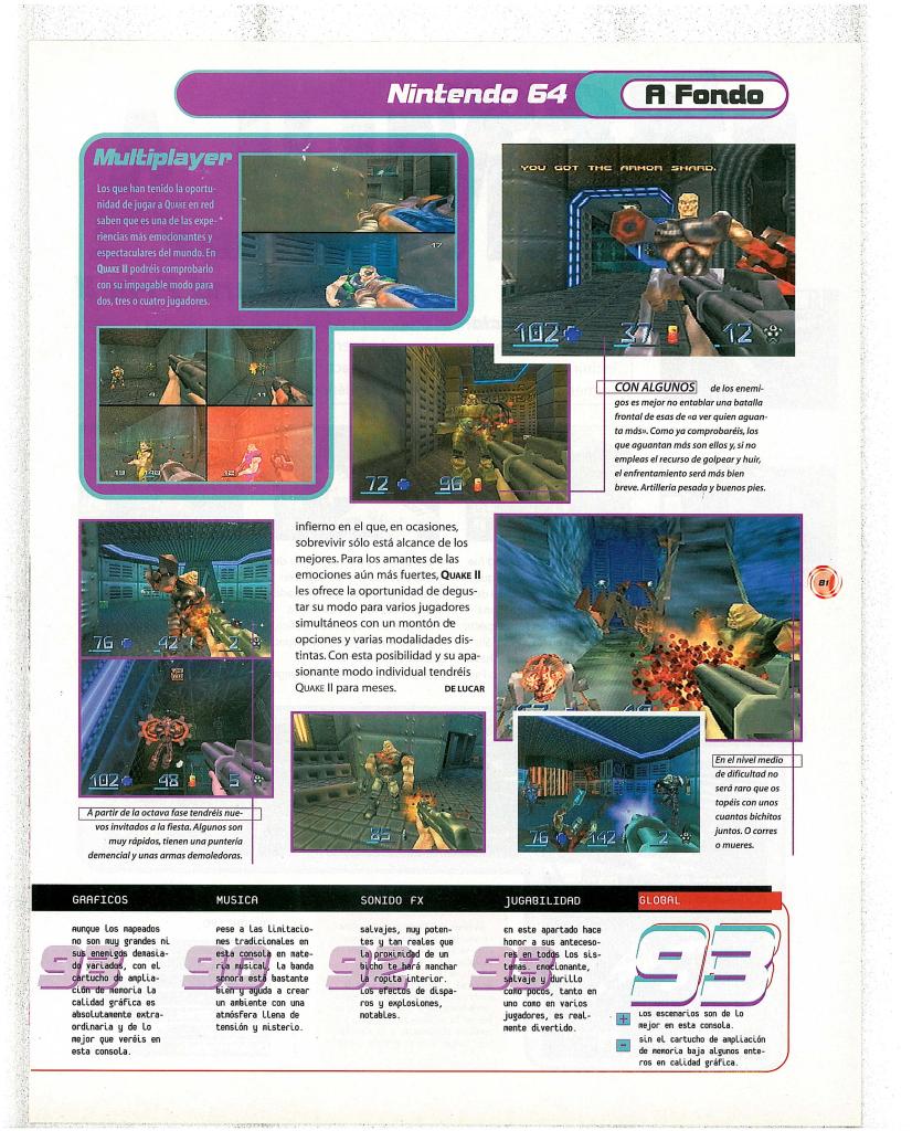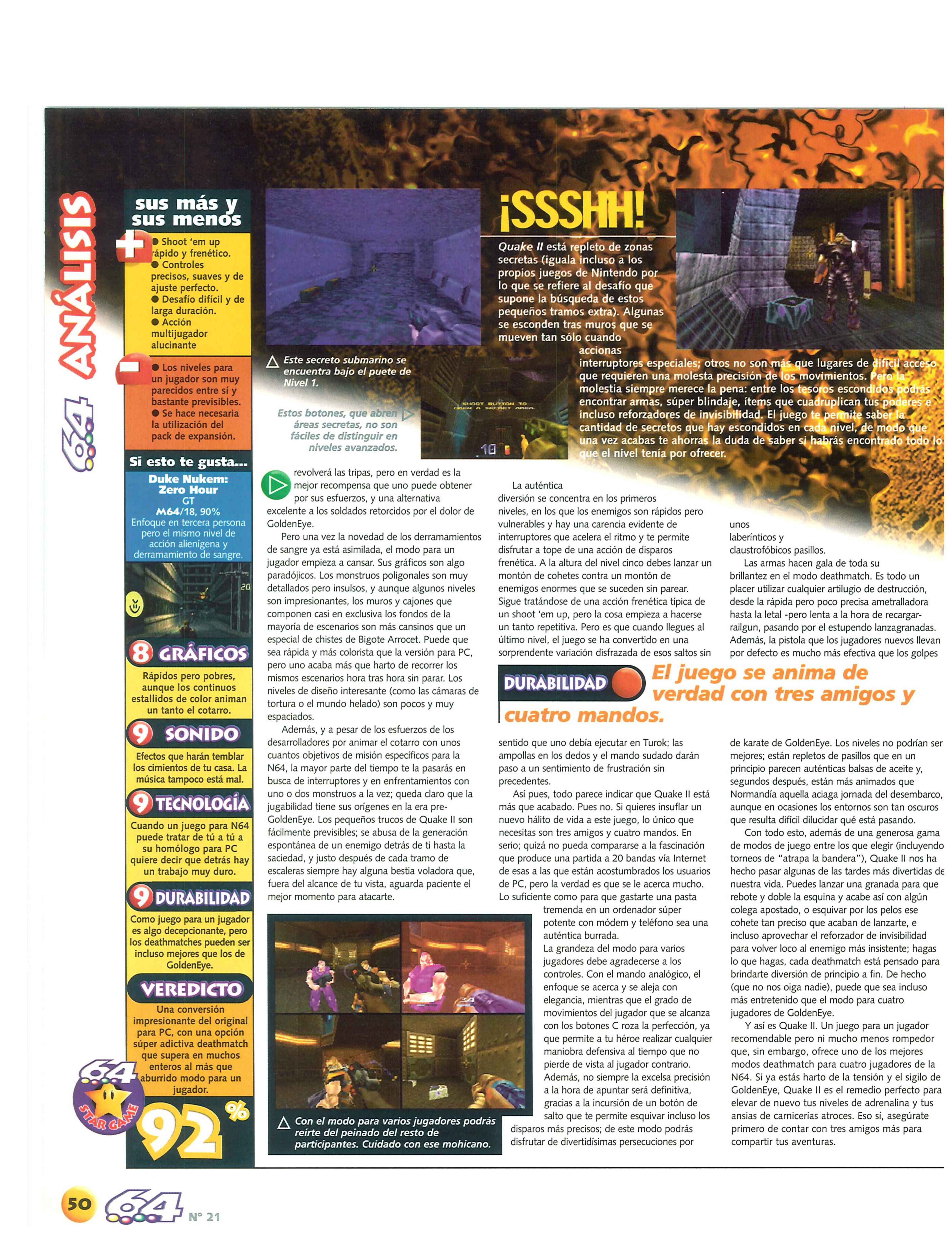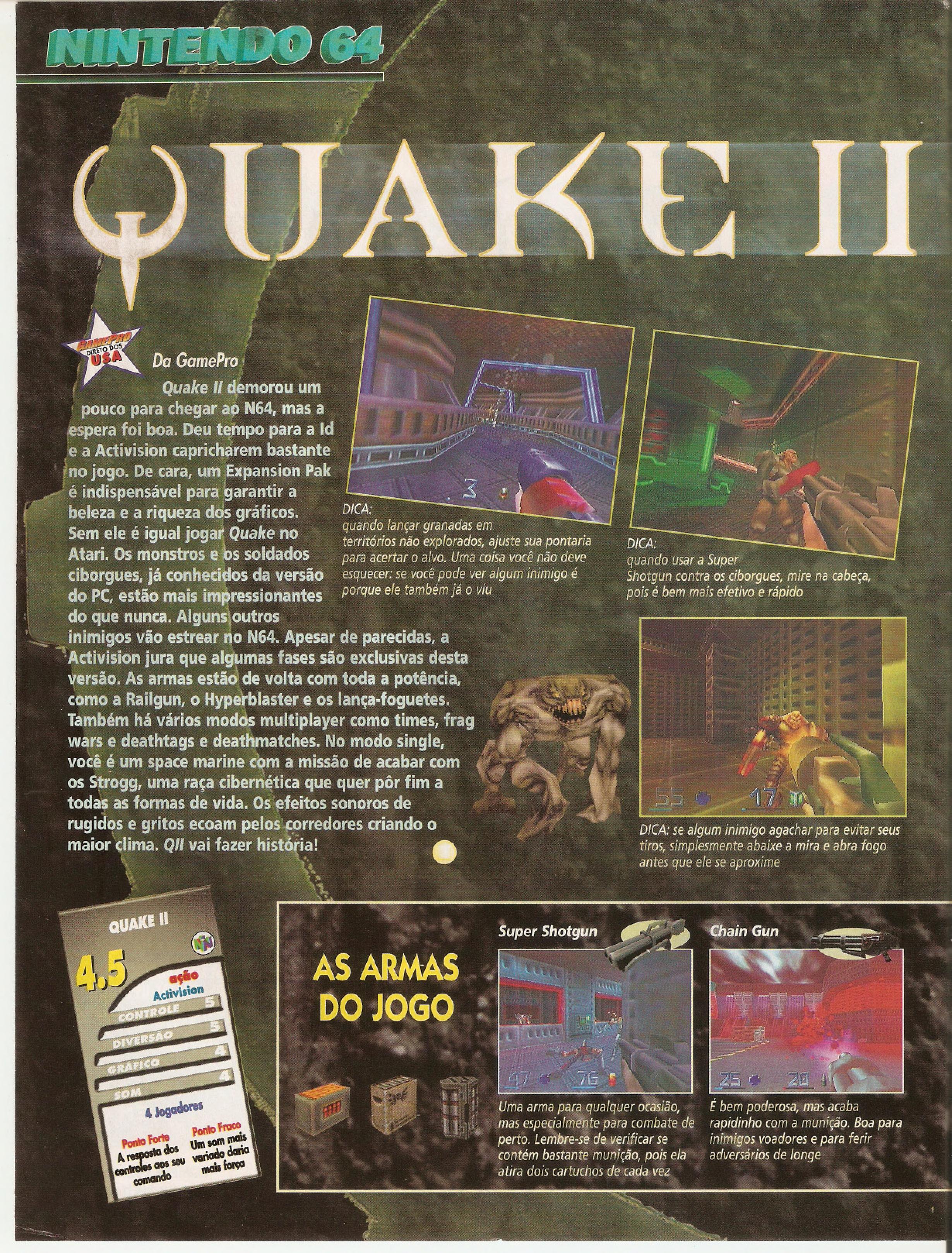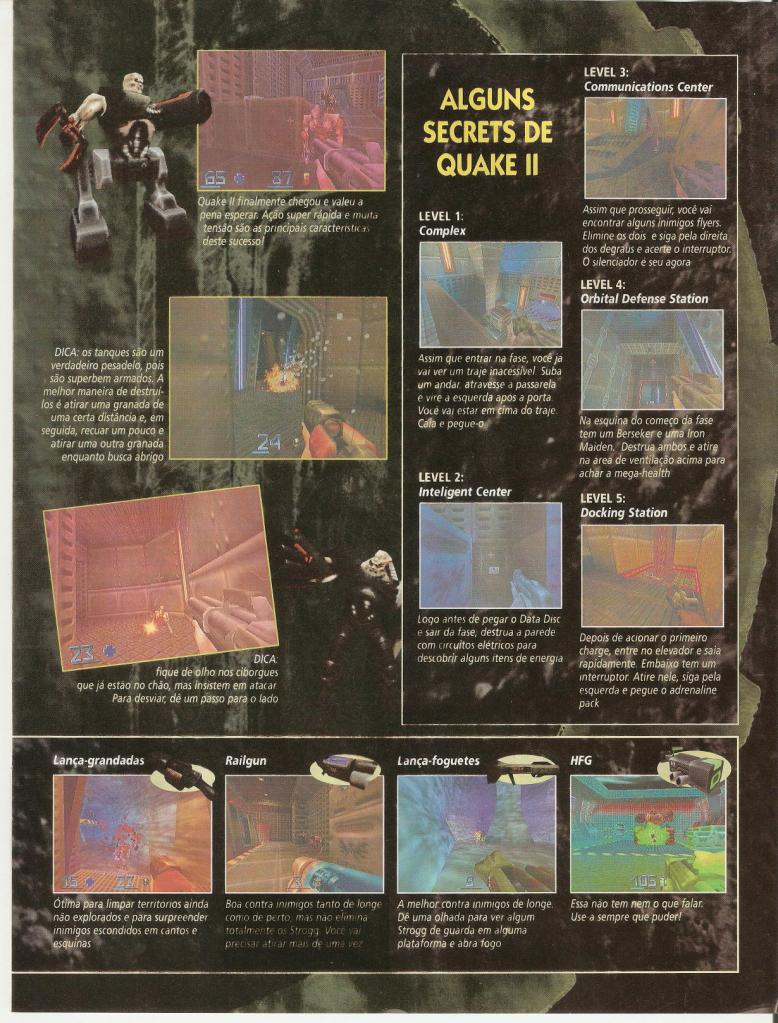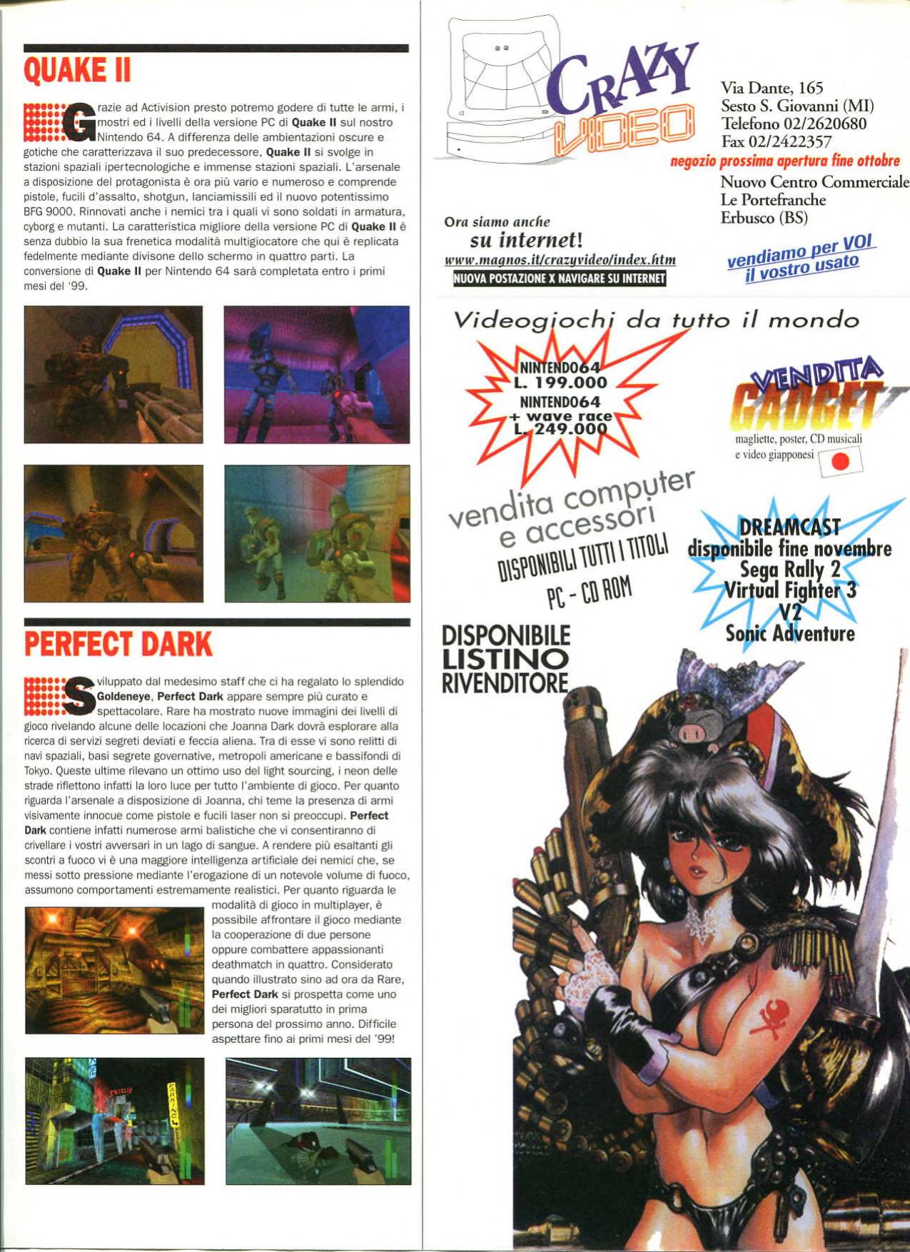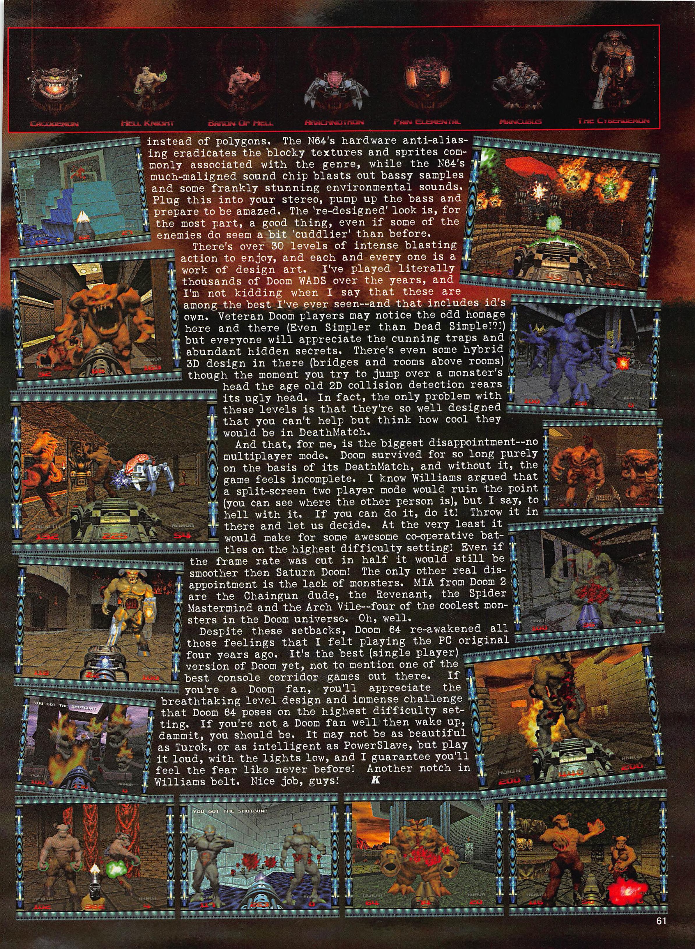
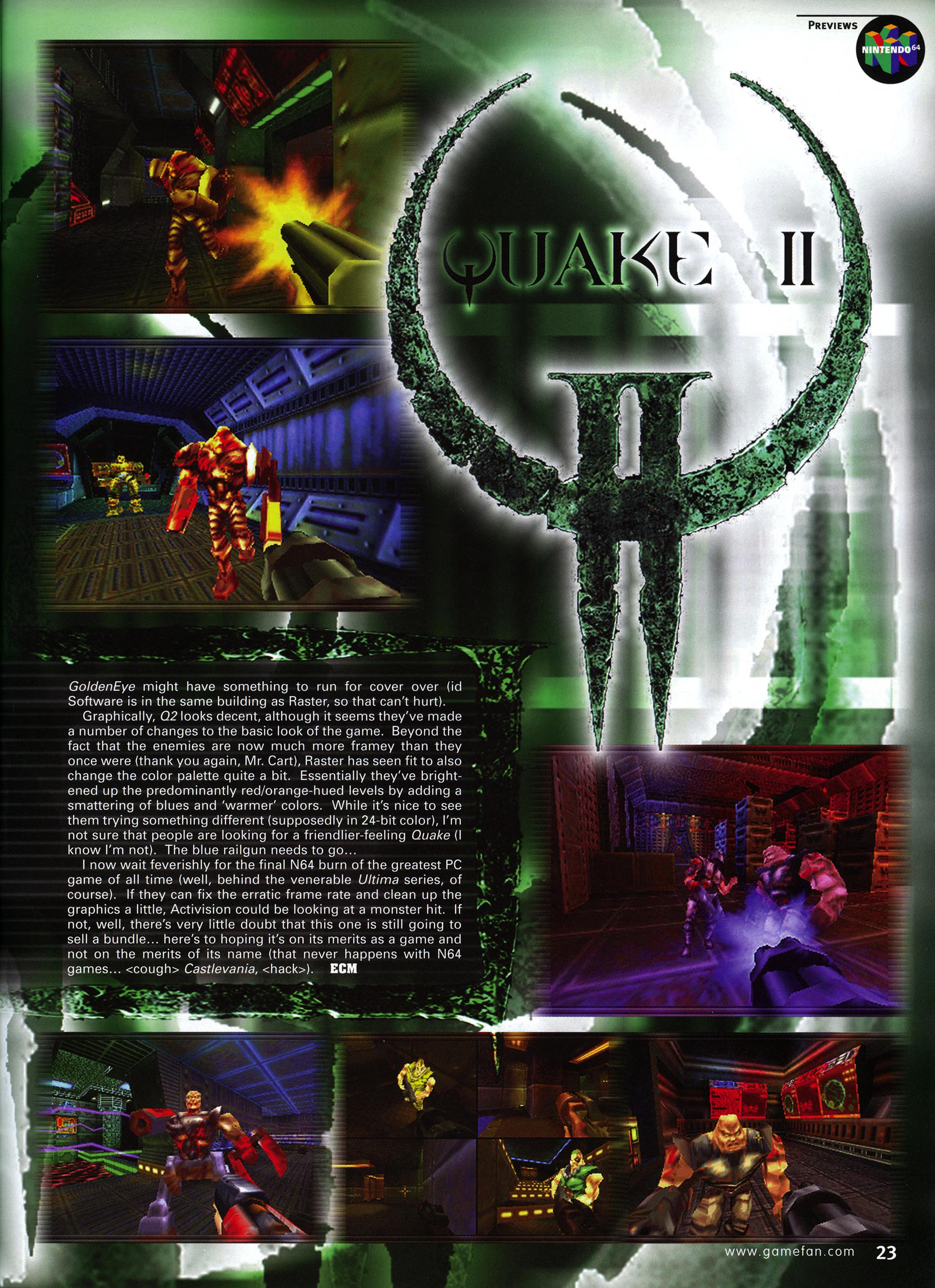
“GoldenEye might have something to run for cover over (id Software is in the same building as Raster, so that can’t hurt). Graphically, Quake 2 looks decent, although it seems they’ve made a number of changes to the basic look of the game. Beyond the fact that the enemies are now much more framey than they once were (thank you again, Mr. Cart), Raster has seen fit to also change the color palette quite a bit. Essentially they’ve brightened up the predominantly red / orange-hued levels by adding a smattering of blues and ‘warmer’ colors. While it’s nice to see them trying something different (supposedly in 24-bit color), I’m not sure that people are looking for a friendlier-feeling Quake (I know I’m not). The blue railgun needs to go… I now wait feverishly for the final N64 burn of the greatest PC game of all time.”

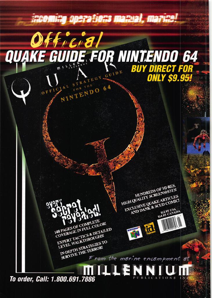
Donde Quake 2?
Archiving the history of the video game Quake 2: created by id Software; customized by the Quake 2 community.